Samarthyam: Redesigning Accessibility, One Pixel at a Time
The Beginning: A Text That Changed the Game
Imagine this: I’m just a few weeks into my internship, trying to find the perfect balance between looking professional and not spilling coffee on my notes, when my manager says, “We’ve got a big project. It’s for Samarthyam—an organization that’s been making the world accessible for 33 years, wanted a fresh look for their website. And guess what? My manager came straight to me. “We’ve seen your work, and we think you’re the right fit.”
UX Design Intern
Now, as an intern, you’d think my job would be making lists or nodding in meetings, right? Wrong. I was in the trenches:
Sitting in client meetings, pitching ideas with the confidence of someone who really hoped their idea wasn’t terrible.
Sorting through 32 years of content like a digital archaeologist.
Designing a brand-new website on Figma, one pixel at a time, while asking myself, “Would this button make sense"
2
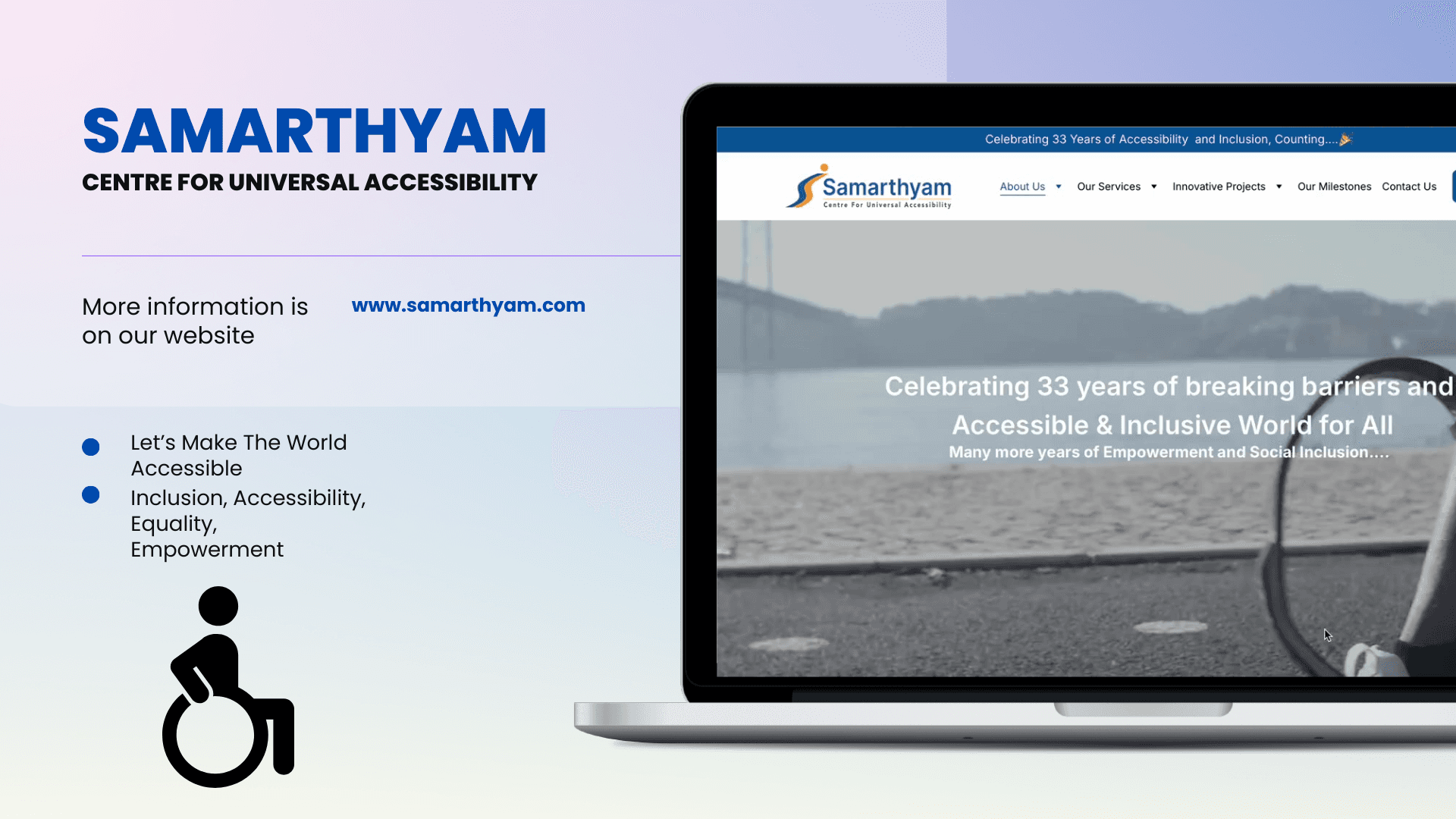
The Mission: A Redesign That Speaks for Everyone
Samarthyam’s old website was packed with incredible content, but it needed a design that could:
Tell their 32-year story in a way that resonated.
Highlight their work in universal accessibility.
Make the site user-friendly for everyone.
With that, I rolled up my sleeves (Idealy—designers don’t wear sleeves) and dove headfirst into the challenge.
The Grand Reveal
The clients loved it. The developer? They practically gave me a standing ovation (digitally, of course). Samarthyam finally had a design that matched their mission—bold, accessible, and user-friendly.
45%
Improved onboarding process
60%
Increase in time spent on website

Process
1. Deep Dive into the Mission
I spent hours understanding their work. Accessibility audits, inclusive tourism, policy advocacy—this wasn’t just a website; it was a movement. My goal? Make sure every pixel echoed their passion.
2. Collaborative Brainstorms
I was in most client meetings, which were part brainstorming, part strategy, and sometimes a bit of a comedy show. My ideas got enthusiastic nods, curious head tilts, and the occasional “Can we even do that?” Let’s just say no whiteboard was left untouched.
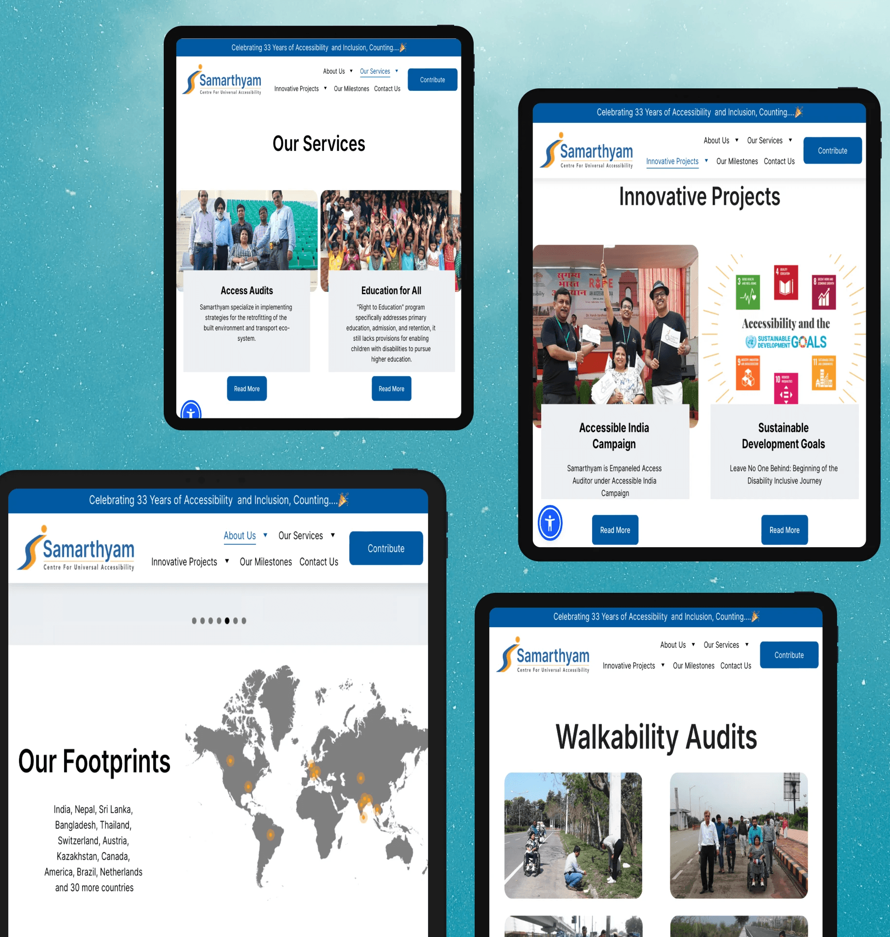
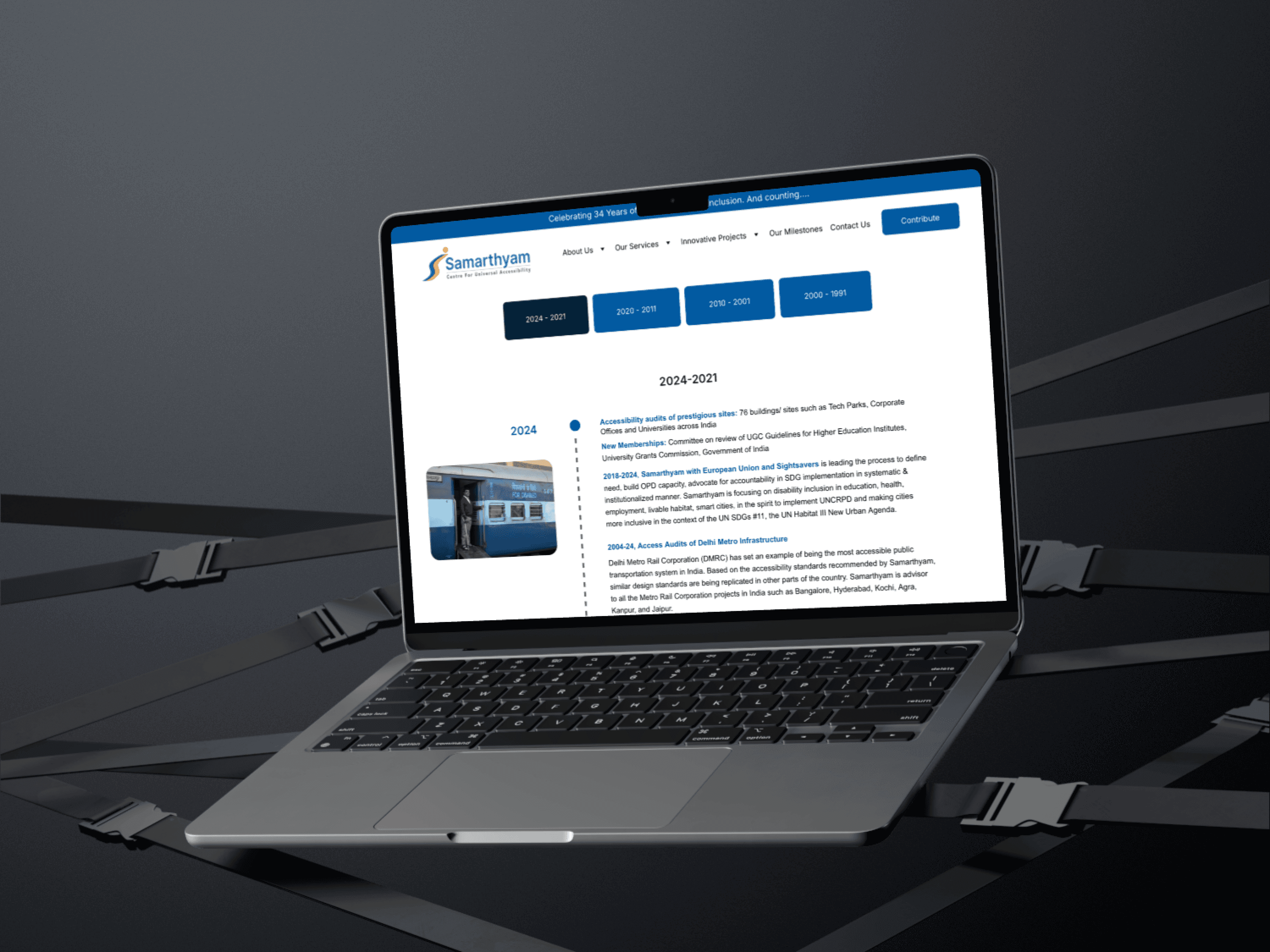
3. Designing with Purpose
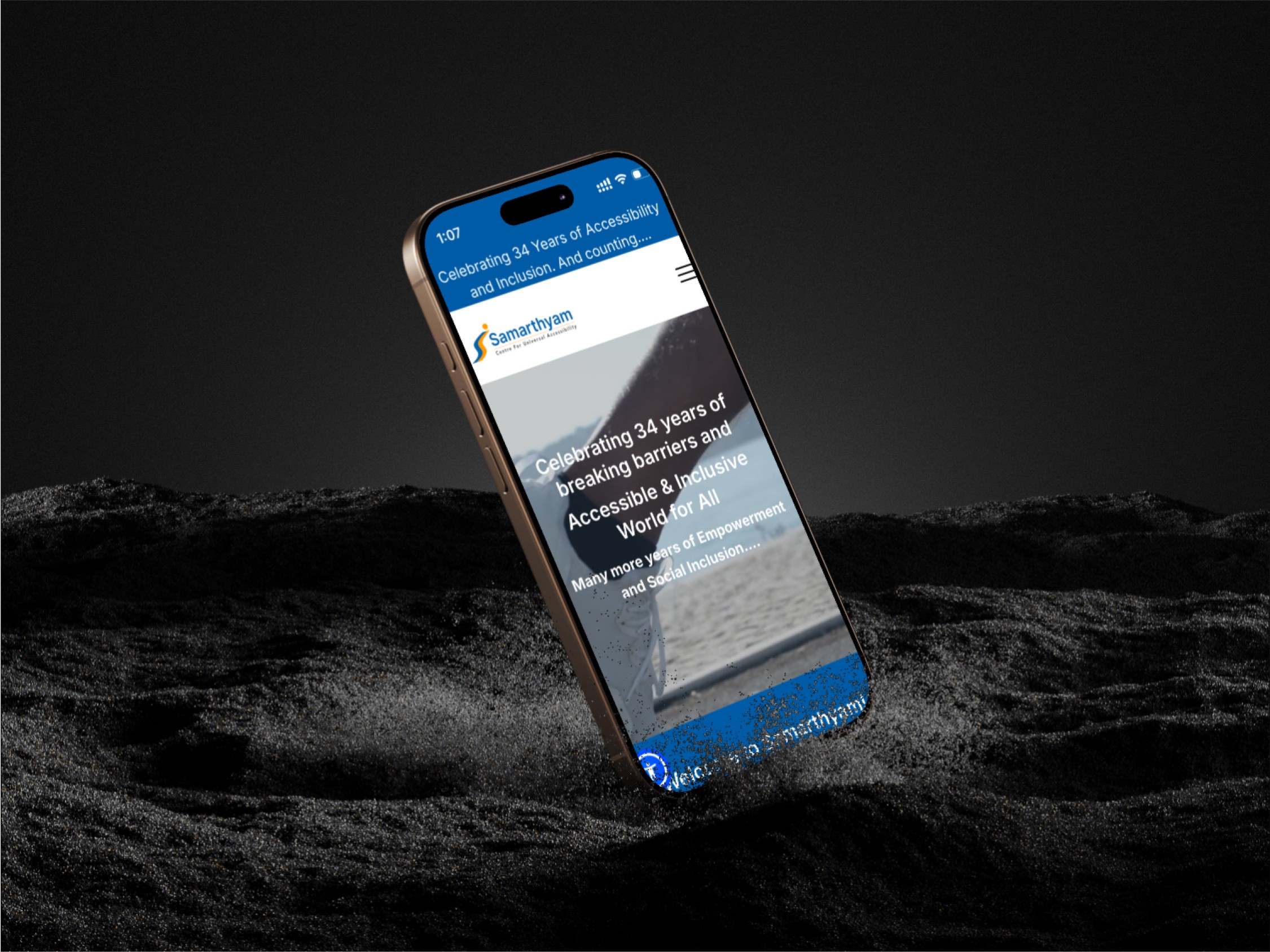
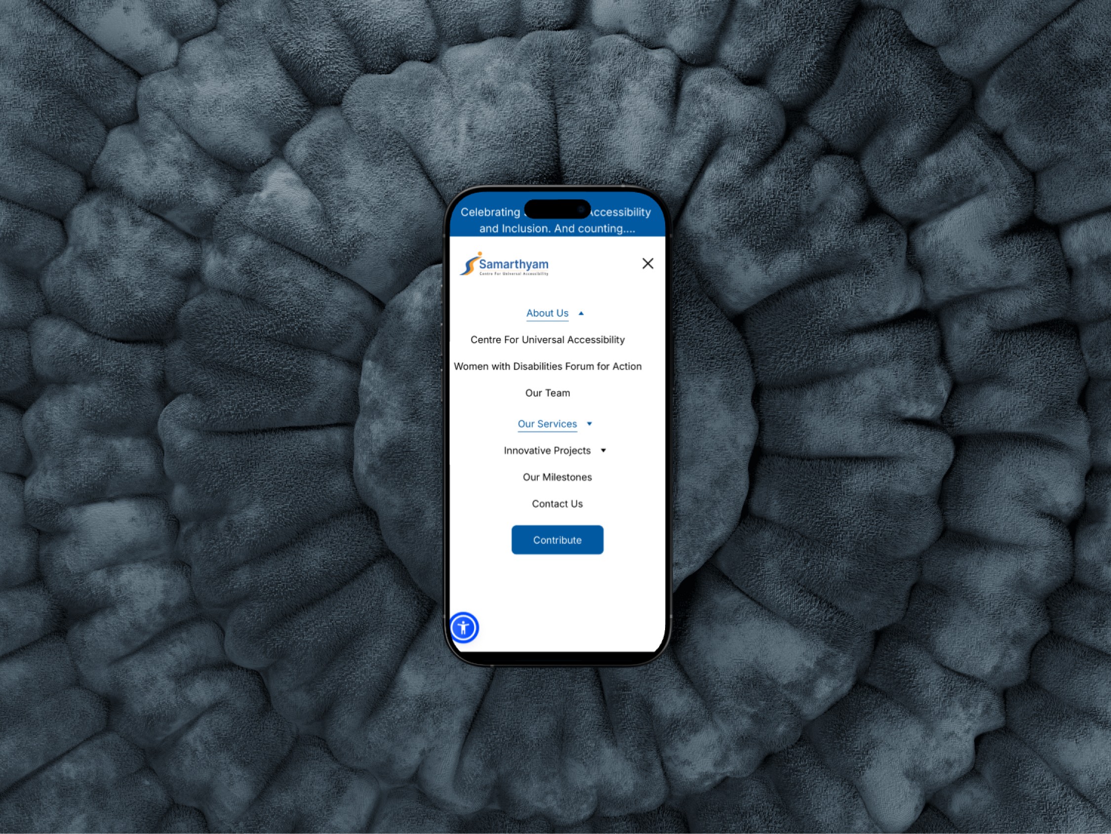
Using Figma, I created a design that was equal parts intuitive and impactful. Each section was carefully thought out:
Hero Section: A bold introduction to their mission, featuring captivating visuals and their core message.
Accessible Navigation: Large, clear buttons with seamless flow. Accessibility isn’t an afterthought—it’s the foundation.
Storytelling in Action: Case studies, testimonials, and stats came to life through engaging layouts.
Modern and Clean Aesthetic: A design that’s easy on the eyes but doesn’t skimp on personality.
4. Testing, Feedback, and Final Touches
Each draft was scrutinized. Feedback was gathered, tweaks were made, and by the end, the design was polished enough to make even the toughest critic smile.
“ The design is fantastic—it captures our mission and makes everything easy to navigate.”
Dr. Anjlee Agarwal
Universal Accessibility & Inclusive Mobility Specialist | Samarthyam
What I Learned
Every pixel matters when you’re designing for impact.
Client meetings are where magic (and occasionally chaos) happens.
Being an intern doesn’t mean taking a back seat—it means jumping in and making it happen.
Never underestimate the power of a well-placed button.