The Design Journey of LB's Bakery
I designed LB's Bakery's visual identity to blend its warm, traditional charm with a modern, inviting aesthetic, using orange and peach to capture its friendly atmosphere.
12 Weeks
UX Designer and Researcher
User research, usability studies, wireframing and prototyping
Challenge
The challenge for LB's Bakery was clear: a beloved local bakery needed a digital makeover to keep up with modern demands. Customers loved the bakery, but long distances, busy schedules, and limited in-store display space made it hard for them to enjoy LB's offerings regularly. To solve these problems, I designed a mobile ordering app, transforming the way customers interacted with LB's Bakery.
The Problem
Inaccessibility for Busy Customers: Working adults, who are a major part of the bakery’s clientele, found it difficult to visit the bakery during their busy schedules.
Lack of Online Ordering Platform: There was no existing platform for customers to order bakery items online, making it inconvenient for those who couldn't visit the bakery in person.
Limited Display Space: The physical space in the bakery was insufficient to showcase all the available items, limiting customer awareness and choice.
Inflexibility in Ordering and Delivery: Customers lacked the flexibility to order and receive bakery items at their convenience, further hindering their ability to enjoy the bakery’s products.
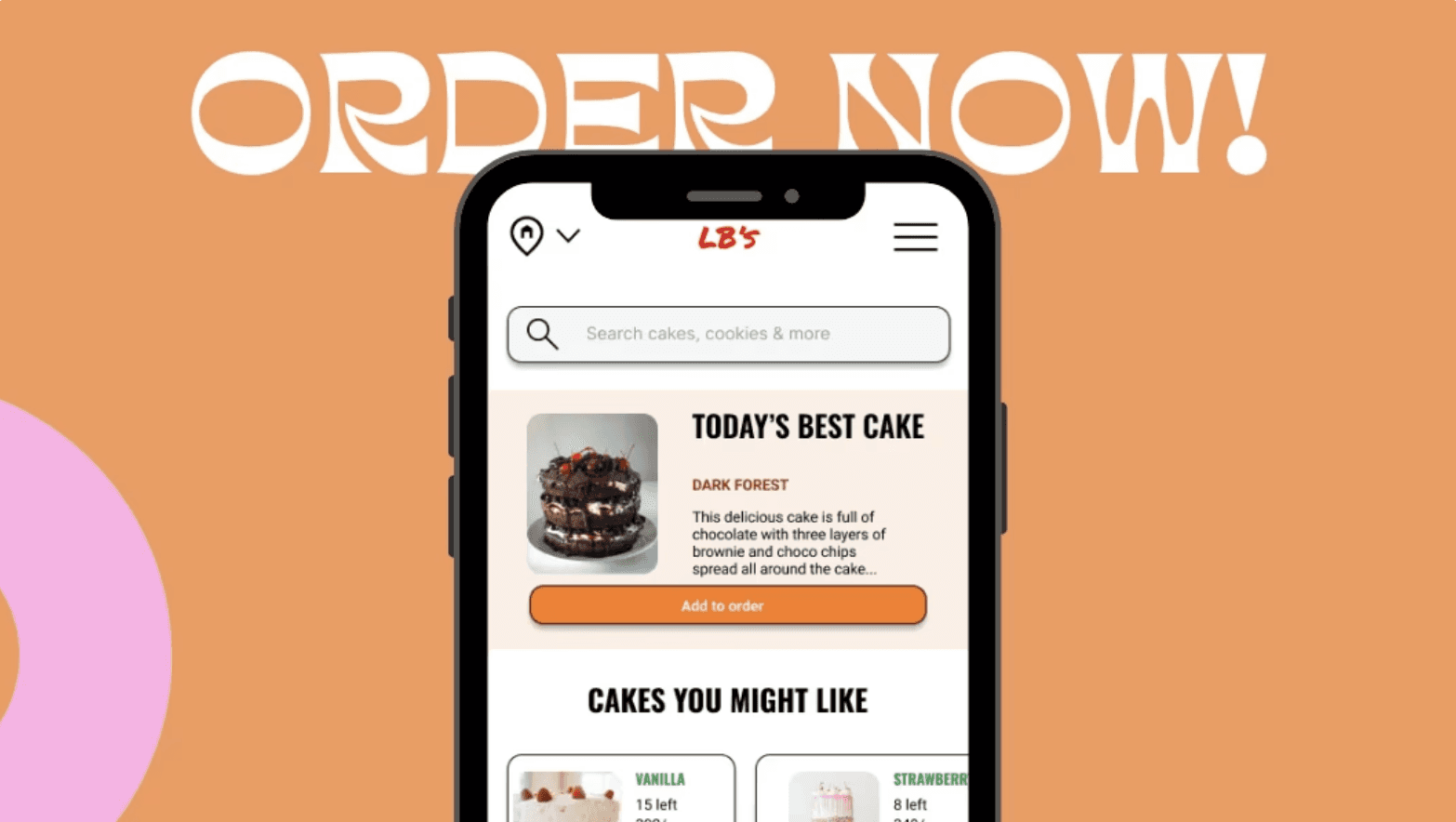
The Solution
The user will initiate the ordering process directly through their mobile application.
The users will get the food delivered to their desired places.
The users will be able to explore all the bakery items that cannot be showcased in the bakery due to less space.
1
Paper Wireframes
2
Digital Wireframes
3
Low - Fidelity Prototypes
4
Usability Study
5
Mockups
6
High - Fidelity Prototypes
User Research: Summary
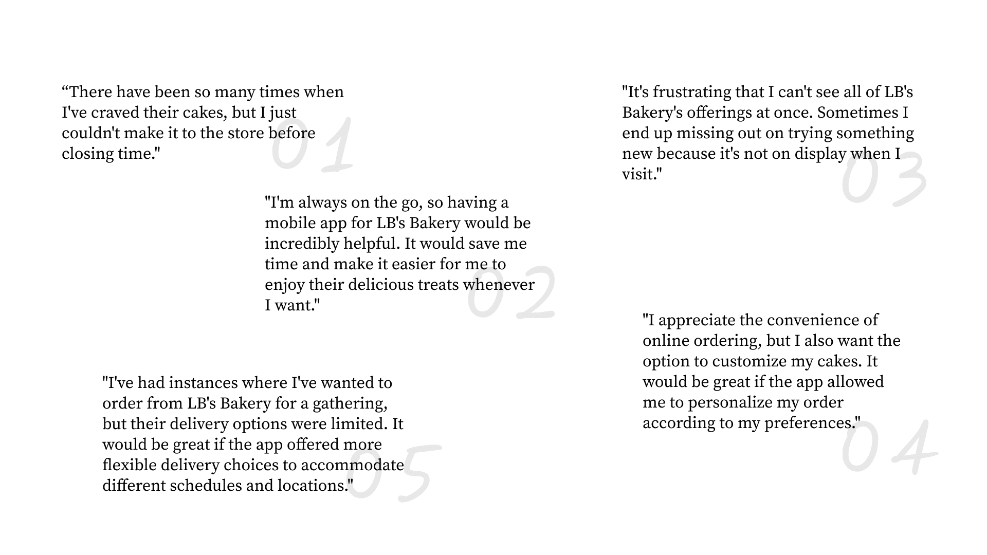
During the ideation phase of the project, I conducted interviews and developed empathy maps to gain insights into the user's perspective, ensuring that the design process was aligned with their requirements. I prepared an interview script with open-ended questions, focusing on our target audience’s values, motivations, and daily routines. In 4 days, I recruited and interviewed 7 users remotely and referenced the user interview findings throughout the entire design process.Through Thorough research, a primary user segment emerged: working adults who indulge in bakery products at least three times weekly. This demographic substantiated our initial assumptions regarding the bakery's target audience.
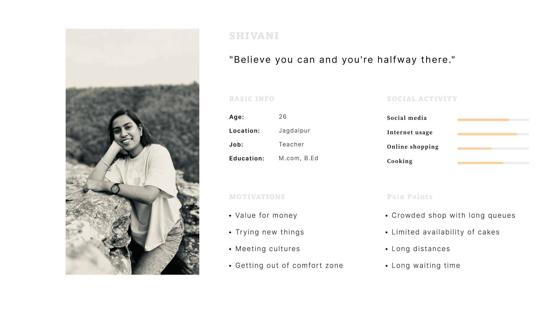
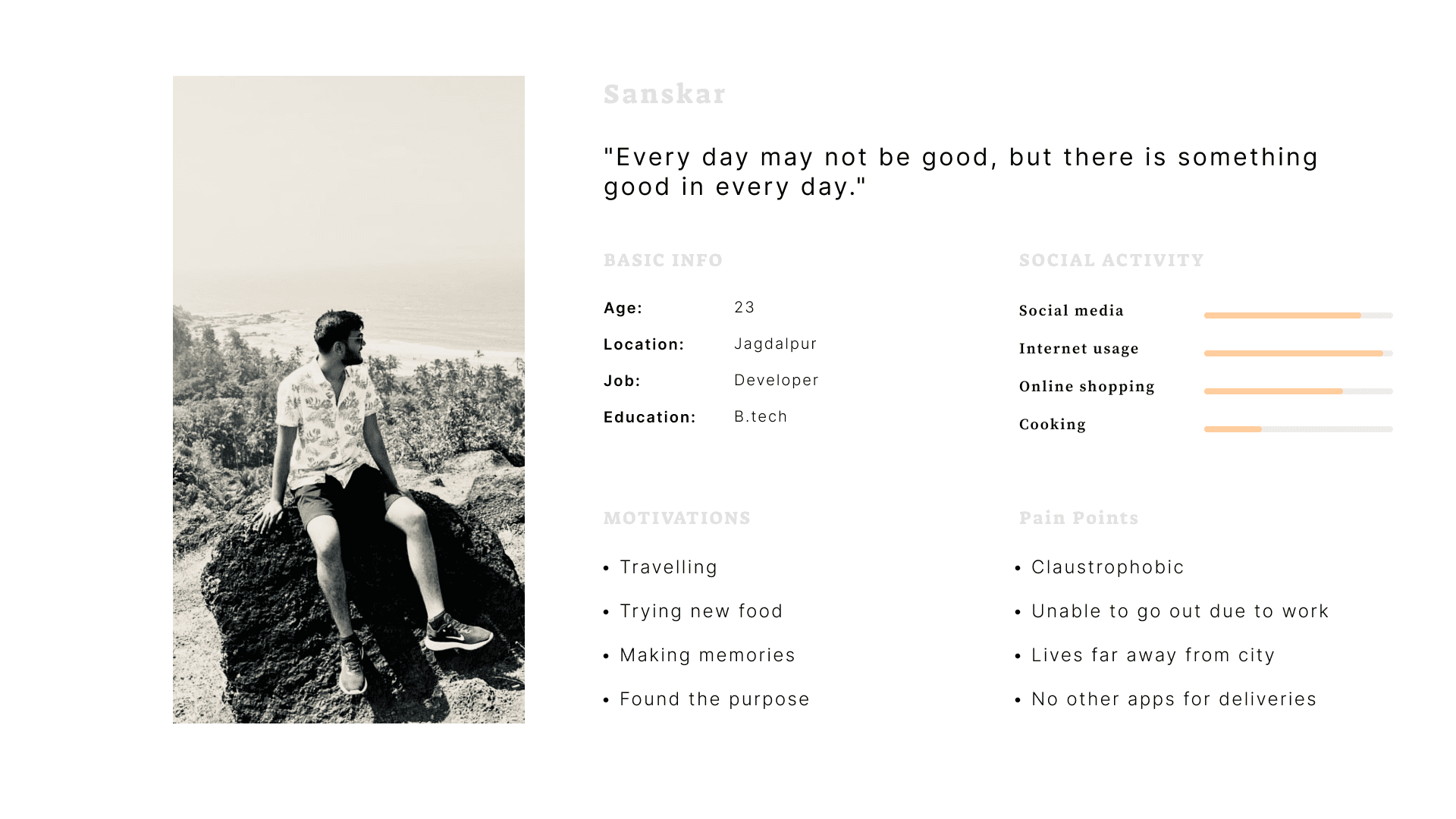
Personas
I wanted to form a deeper understanding of our user's needs, experiences, and behaviors. So, I created 2 personas for each of our user segments. They were based on user interviews and surveys, and I kept updating them throughout the project as I gathered more data. I used these personas whenever I wanted to step out of myself and reconsider My initial ideas.
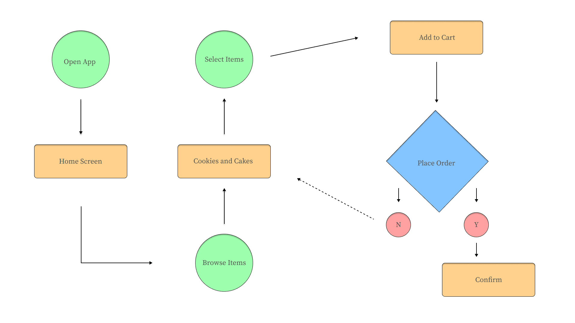
User Journey
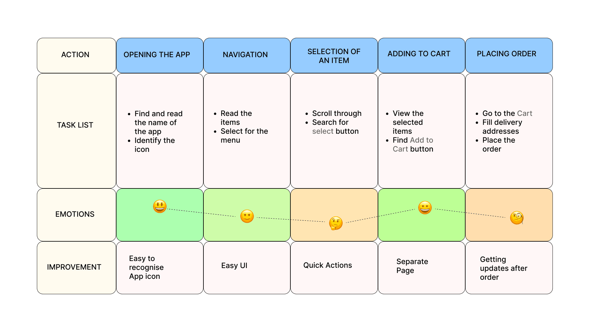
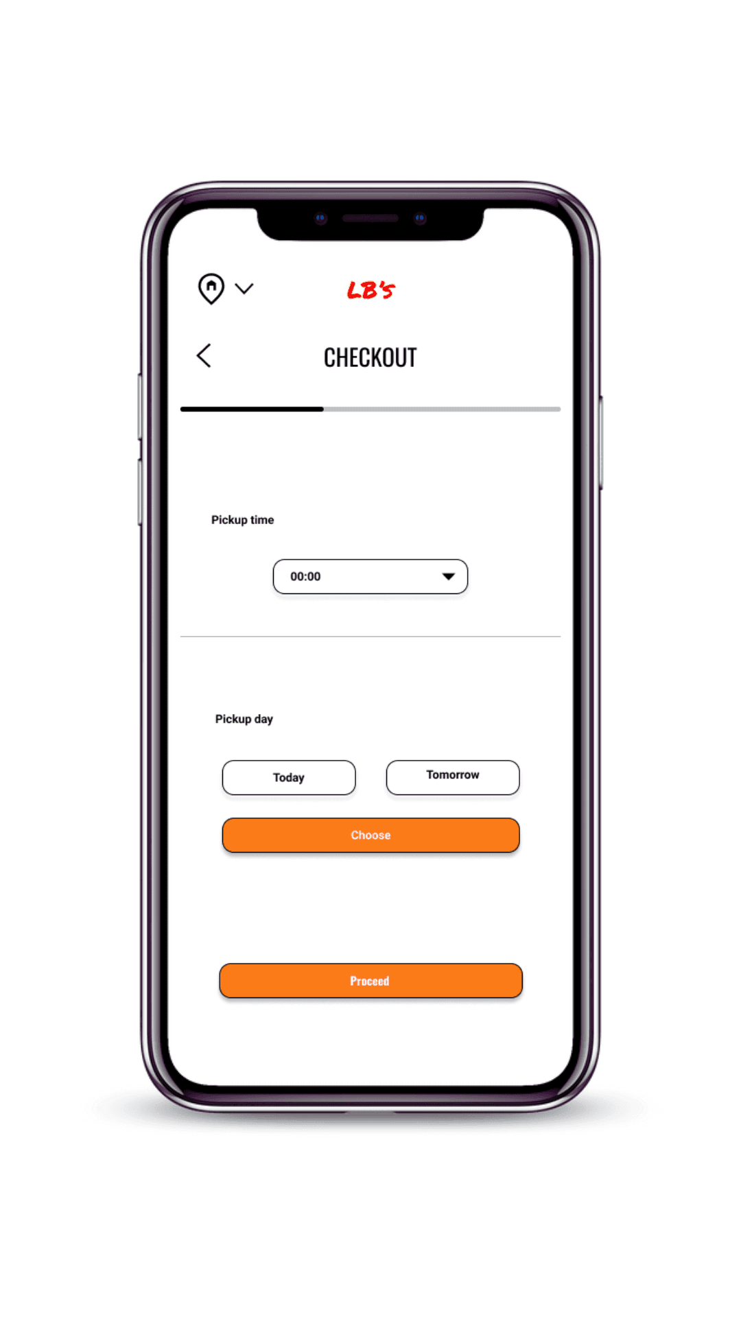
With the user's emotion spectrum in mind, I make sure that the users reach the checkout screen without any hiccups. So, I sketched a current-state user journey map, to identify opportunities for improvement. I identified 1 unnecessary step and potential dropoff point in the flow. By eliminating this from the new design, I ended up with a much faster checkout experience that contributed to customer satisfaction.
Customer Journey
I created a customer journey map to build a better understanding of how customers find and interact with the App and to discover opportunities for improvement. The map revealed many user problems and opportunities at the consideration and loyalty stages of the customer journey. Therefore, it was necessary to pay special attention to these stages during the design process.
Paper Wireframes
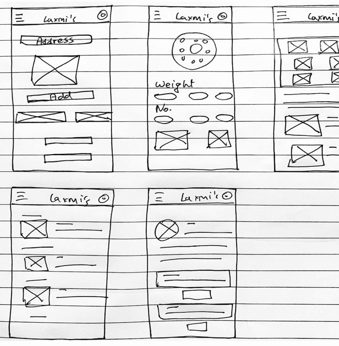
I began the design process with low-fidelity sketches and wireframes to accelerate decision-making through visualization without losing time. My sketches were based on the initial user interviews and the App's goal.
Low - Fidelity Wireframes
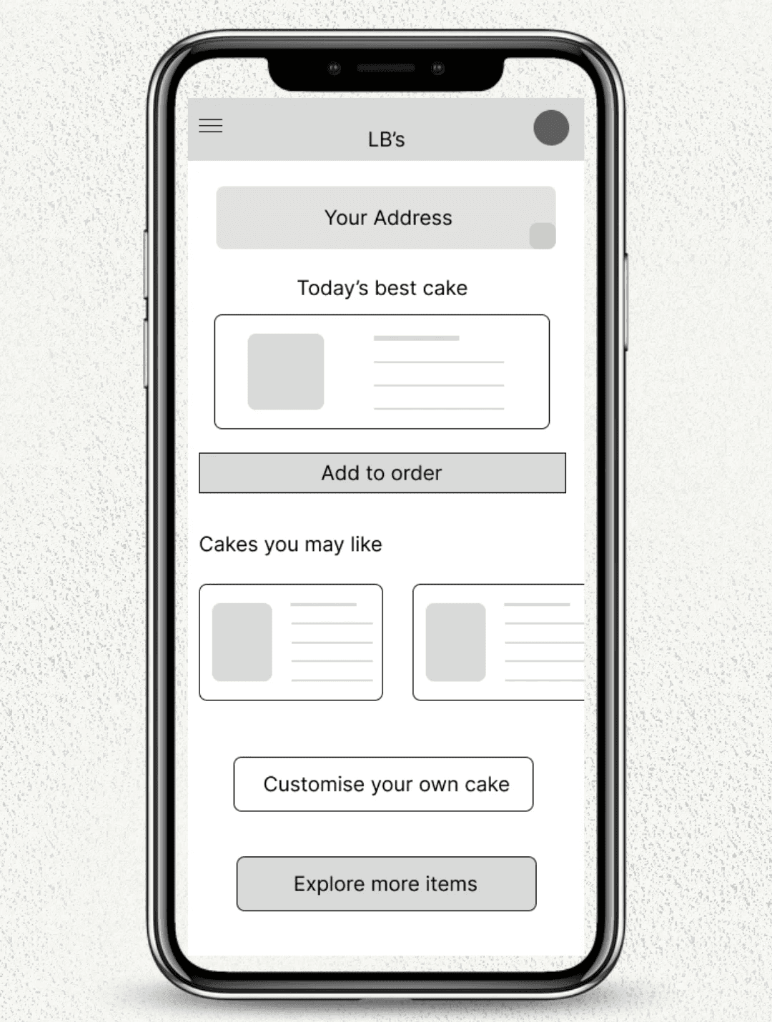
To begin, I sketched several versions of potential home screens on paper, iterating based on key user needs identified during the research phase. The primary objective was to ensure a seamless and intuitive navigation experience that allowed users to quickly and easily order their favorite bakery items. A prominent feature on the home screen was the "Today’s Best Cake" option, allowing users to quickly order the bakery’s highlight of the day. Quick access buttons for categories such as "Cakes," "Cookies," and "Pastries" enabled users to browse through the offerings efficiently.
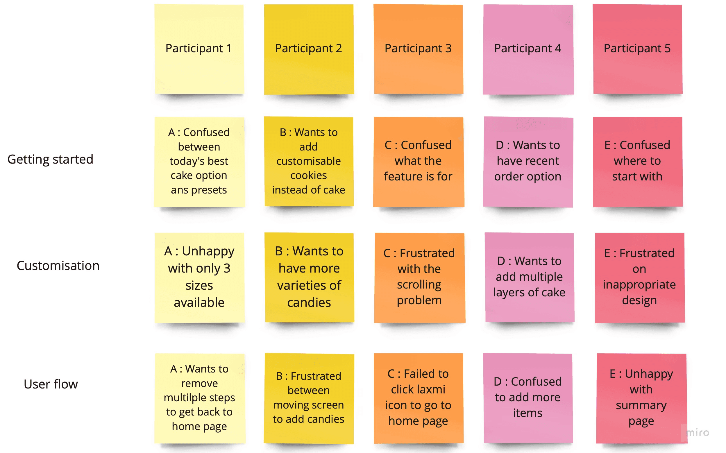
Usability Testing
Two rounds of usability studies were conducted to gather feedback and refine the design. Each round focused on specific aspects of the user experience, from initial navigation to detailed interactions within the app.
Round 1: Initial Usability Study
Participants were asked to perform key tasks, such as browsing the menu, customizing a cake, and placing an order.
Findings:
Customization Needs: Users wanted more options for customizing their cakes, including additional toppings and personalized messages.
Navigation Clarity: Some users found the navigation slightly confusing, particularly in accessing different product categories.
Order Summary: Users requested a clearer, more detailed order summary before finalizing their purchase.
Actions Taken:
Enhanced the customization feature with more options.
Improved the navigation flow by adding clearer labels and more intuitive icons.
Revised the order summary screen to include all necessary details and options for modification.
Round 2: Follow-Up Usability Study
Participants, including some from the initial study, were asked to complete similar tasks with the updated prototype.
Positive Feedback on Customization: Users were pleased with the expanded customization options and found them easy to use.
Improved Navigation: The revised navigation structure was well-received, with users reporting a smoother browsing experience.
Order Summary Approval: The detailed order summary was appreciated, with users feeling more confident about their purchases.
Actions Taken:
Made minor adjustments based on additional user suggestions, such as improving the visibility of promotional items and offers.
Fine-tuned the app’s responsiveness and loading times to ensure a seamless user experience.
UI Designs
The UI design phase was a transformative step in bringing LB's Bakery mobile app to life. Moving from wireframes to high-fidelity prototypes, the focus was on creating an aesthetically pleasing, user-friendly interface that captured the essence of LB's Bakery's warm, inviting brand.
Design Goals
Consistency with Brand Identity: The UI design had to reflect LB's Bakery's brand, characterized by its orange and peach color palette, evoking warmth, freshness, and a welcoming atmosphere.
Intuitive User Experience: Ensure the design was straightforward, enabling users to navigate the app effortlessly and complete tasks with ease.
Visual Appeal: Incorporate visually engaging elements that would attract and retain users, enhancing their overall experience.

Learnings
The Design of LB's Bakery mobile app was a rich learning experience, revealing valuable insights about user-centered design, the importance of iterative testing, and the Purpose of creating a seamless digital experience for a local business. Here are the key takeaways from the project:
User-Centered Design is Crucial
One of the most significant lessons was the importance of deeply understanding our users. By conducting thorough user research and creating detailed personas, we were able to design an app that truly catered to the needs and preferences of LB's Bakery customers.
Empathy Mapping: This tool helped us visualize users’ experiences and pain points, leading to a more empathetic design approach.
User Personas: Developing personas like Krutika, the busy automotive engineer, guided our design decisions and ensured we focused on real user needs.
Iterative Testing and Feedback Loops
Usability studies were invaluable in refining the app. Each round of testing provided critical feedback that informed iterative improvements.
Initial Assumptions vs. Reality: Initial ideas often required significant adjustments based on real user feedback, highlighting the importance of being open to change.
Continuous Improvement: Iterative testing allowed us to progressively enhance the app, making it more intuitive and user-friendly with each cycle.